
To illustrate the impact of responsive web design, let’s look at some real-world examples of businesses that have successfully implemented responsive design and reaped the benefits.
Case Study 1: A Local Restaurant
A local restaurant, facing stiff competition and declining foot traffic, decided to revamp its outdated website. By implementing a responsive design, the restaurant made it easy for potential customers to browse the menu, make reservations, and find directions—all from their mobile devices. The result? A significant increase in online reservations and positive customer feedback. The restaurant also saw a boost in organic search traffic, as its mobile-friendly site ranked higher in local search results.
Case Study 2: An E-commerce Store
An e-commerce store specializing in handmade crafts noticed that a large portion of its traffic was coming from mobile devices, but the conversion rate was disappointingly low. After analyzing the data, the store owner realized that the non-responsive website was causing frustration for mobile users. By redesigning the site to be fully responsive, the store provided a seamless shopping experience across all devices. This led to a substantial increase in mobile sales and an overall improvement in customer satisfaction.
Case Study 3: A Professional Services Firm
A professional services firm offering consulting and legal services aimed to attract more clients through its website. The firm’s outdated, non-responsive site was not providing a good user experience, especially for mobile users. By implementing a responsive design, the firm ensured that visitors could easily access information about their services, read client testimonials, and contact the firm from any device. The redesign resulted in higher engagement rates, more inquiries, and ultimately, more clients for the firm.
The Role of Analytics in Responsive Web Design
Analytics play a crucial role in the success of a responsive web design project. By leveraging data, you can make informed decisions about your site’s design and functionality.
Key Metrics to Monitor
- Device Usage: Understand which devices your audience uses to access your site. This information will help you prioritize and tailor your design to meet the needs of your users.
- Bounce Rate: Monitor the bounce rate for different devices. A high bounce rate on mobile devices, for example, may indicate that your site is not providing a good mobile experience.
- Conversion Rate: Track conversion rates across different devices. If your desktop conversion rate is significantly higher than your mobile conversion rate, it may be time to reevaluate your mobile design.
- User Behavior: Analyze how users interact with your site on various devices. Tools like heatmaps can show you where users are clicking, scrolling, and spending the most time, providing valuable insights for optimizing your design.
Using Analytics to Drive Continuous Improvement
- Identify Pain Points: Use analytics to identify pain points and areas where users are experiencing difficulties. Addressing these issues can lead to a more seamless and enjoyable user experience.
- Test and Iterate: Continuously test different design elements and make data-driven adjustments. A/B testing can help you determine which changes have the most positive impact on user experience and conversions.
- Stay Updated: Regularly review your analytics to stay informed about changing user behaviors and preferences. This ongoing analysis will help you keep your site current and responsive to user needs.
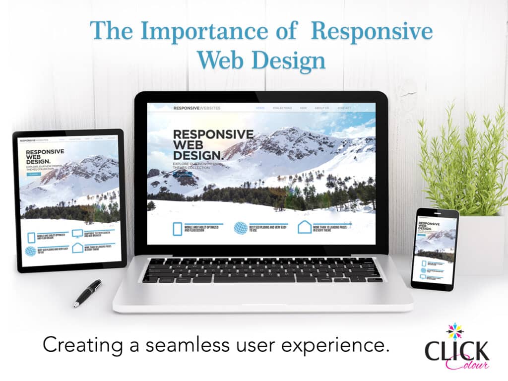
Responsive web design is a powerful tool that can transform your online presence and drive business growth. By creating a seamless user experience across all devices, you can attract and retain more customers, improve SEO rankings, and future-proof your website against changing technologies.
For small and medium-sized businesses, investing in responsive web design is not just a trend—it’s a necessity. By understanding the importance of responsive design and implementing the practical strategies outlined in this post, you can create a website that meets the needs of your audience and stands out in the digital marketplace.