In the digital age, your website is often the first impression your business makes. For small and medium-sized businesses (SMBs), a strong online presence can set you apart from the competition and help you reach a broader audience. A critical aspect of this online presence is responsive web design. In this blog post, we’ll delve into why responsive web design is vital for SMBs, how it enhances user experience, and practical tips for implementing it effectively.
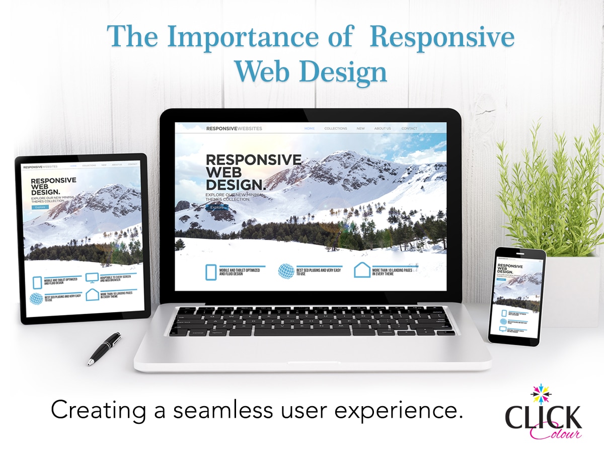
What is Responsive Web Design?
Responsive web design is an approach to web design that ensures a website’s layout and content adapt to various screen sizes and devices. The goal is to provide an optimal viewing experience—easy reading and navigation with minimal resizing, panning, and scrolling—across a wide range of devices, from desktop monitors to mobile phones.
The Digital First Impression
Imagine this scenario: A potential customer hears about your business and decides to check out your website on their smartphone. They are immediately greeted with a site that fits perfectly on their screen, loads quickly, and is easy to navigate. This seamless experience leaves a positive impression, making them more likely to explore further and eventually become a loyal customer. This is the power of responsive web design.
Why First Impressions Matter
- Psychological Impact: First impressions are formed within milliseconds. A well-designed, responsive website can quickly establish trust and credibility, which is crucial for SMBs competing against larger companies with more established brands.
- User Expectations: Modern users expect a seamless experience across all devices. A website that fails to deliver this can frustrate users and drive them away.
- Competitive Edge: In a crowded market, a professional-looking, responsive website can set you apart from competitors who may not have invested in updating their online presence.
Enhanced User Experience
User experience (UX) is the overall experience a person has when interacting with your website. A responsive design significantly enhances UX by ensuring that users can easily find the information they need, regardless of the device they are using.
Key Elements of Enhanced UX
- Consistency: A responsive website provides a consistent look and feel across all devices, which helps in building brand identity and trust.
- Navigation: Simplified and intuitive navigation ensures users can easily access the information they seek, leading to higher engagement and satisfaction.
- Performance: Fast-loading pages are crucial for retaining visitors. Responsive design techniques, such as optimizing images and leveraging browser caching, help improve site performance.
- Accessibility: A responsive website is more likely to comply with accessibility standards, making it usable for people with disabilities and thus broadening your potential audience.
Increased Mobile Traffic
The rise of mobile internet usage is undeniable. According to recent statistics, over half of global web traffic comes from mobile devices. Ignoring this trend can be detrimental to your business.
Capturing Mobile Users
- Reach a Larger Audience: By ensuring your website is mobile-friendly, you can tap into a vast pool of potential customers who prefer browsing on their smartphones and tablets.
- Adapt to User Behavior: Mobile users often browse websites differently than desktop users. Responsive design allows you to cater to these differences, such as touch navigation and vertical scrolling.
Improved SEO Rankings
Search engine optimization (SEO) is vital for driving organic traffic to your website. Google and other search engines prioritize mobile-friendly websites in their rankings, making responsive web design a critical component of SEO.
SEO Benefits of Responsive Design
- Single URL: Responsive design eliminates the need for separate mobile and desktop URLs, making it easier for search engines to crawl and index your site.
- Reduced Bounce Rate: A well-designed responsive site can decrease bounce rates, as users are less likely to leave a site that provides a good experience.
- Increased Dwell Time: When users have a positive experience on your site, they are more likely to stay longer, which can signal to search engines that your site is valuable and relevant.
Cost-Effective and Easy Maintenance
Managing separate websites for desktop and mobile can be both time-consuming and expensive. Responsive design simplifies this process by allowing you to maintain a single site that works across all devices.
Advantages of Unified Maintenance
- Reduced Costs: With a single responsive site, you save on development and maintenance costs, as you don’t need to create and manage multiple versions of your site.
- Streamlined Marketing: A unified website makes it easier to implement and manage marketing strategies, such as content updates and promotions, across all platforms.
Future-Proofing Your Website
The digital landscape is continually evolving, with new devices and screen sizes emerging regularly. Responsive web design ensures that your site remains accessible and functional, regardless of these changes.
Adaptability to New Technologies
- Emerging Devices: From smartwatches to large-screen TVs, new devices with varying screen sizes are constantly being introduced. Responsive design helps ensure that your site can adapt to these new formats.
- Technological Advancements: As web technologies evolve, having a responsive site makes it easier to integrate new features and improvements, keeping your site up-to-date and competitive.
Implementing Responsive Web Design
Now that we understand the importance of responsive web design, let’s explore some practical tips for implementing it effectively.
Mobile-First Approach
A mobile-first approach involves designing for the smallest screen first and gradually enhancing the experience for larger screens. This ensures that essential content is prioritized and that the site works well on all devices.
- Simplified Design: Start with a clean, minimalist design that works well on small screens. Avoid clutter and focus on essential elements.
- Progressive Enhancement: As you move to larger screens, add more features and enhancements that take advantage of the additional space.
Flexible Grids and Layouts
Using relative units like percentages instead of fixed units like pixels helps create flexible grids and layouts that adjust to different screen sizes.
- Fluid Grid Layout: Design your layout using a fluid grid that can adapt to various screen sizes. This ensures that content is displayed appropriately on any device.
- Flexible Images: Use CSS techniques like max-width: 100%; to ensure that images scale appropriately and do not exceed the screen width.
Media Queries
CSS media queries allow you to apply different styles based on the device’s screen size and orientation. This enables a customized experience for each user.
- Breakpoints: Define breakpoints in your CSS where the layout should change to accommodate different screen sizes. Common breakpoints include 320px (small smartphones), 768px (tablets), and 1024px (desktops).
- Conditional Styles: Apply specific styles for different breakpoints to ensure that the design looks good on all devices.
Performance Optimization
Optimizing your site’s performance is crucial for a positive user experience. Slow-loading sites can drive users away and negatively impact your SEO rankings.
- Minimize File Sizes: Compress images, CSS, and JavaScript files to reduce their size and improve load times.
- Efficient Coding Practices: Write clean, efficient code that minimizes unnecessary elements and reduces the overall load on the site.
- Browser Caching: Leverage browser caching to store frequently accessed files locally, reducing load times for returning visitors.
Testing and Optimization
Once your responsive design is implemented, it’s essential to test it thoroughly and make ongoing optimizations to ensure the best possible user experience.
- Cross-Device Testing: Test your site on a variety of devices and screen sizes to ensure that it looks and functions as intended.
- User Feedback: Gather feedback from real users to identify any issues or areas for improvement. Conduct usability tests and surveys to gain insights into user experiences.
- Continuous Improvement: Regularly monitor your site’s performance and adjust as needed. Stay updated on the latest web design trends and best practices to keep your site current.
In the digital age, responsive web design is not just a trend—it’s a necessity. For small and medium-sized businesses, investing in a responsive website can significantly enhance user experience, increase mobile traffic, improve SEO rankings, and reduce maintenance costs. By prioritizing a seamless and enjoyable experience for your users, you can build a strong online presence that sets your business apart from the competition.
Embrace the principles of responsive web design and implement the practical strategies outlined in this post to create a website that meets the needs of your audience and adapts to the ever-changing digital landscape. Your website is often the first impression your business makes—make it a positive one by ensuring it is responsive and user-friendly.