The digital landscape has undergone a profound transformation in recent years, with mobile devices now dominating internet usage. As small and medium-sized businesses (SMBs) strive to maintain a strong online presence, embracing a “mobile-first” approach to web design has become essential. In this blog post, we will explore the concept of mobile-first design and how SMBs can leverage it to create websites that cater to the ever-growing mobile audience.
Understanding Mobile-First Design
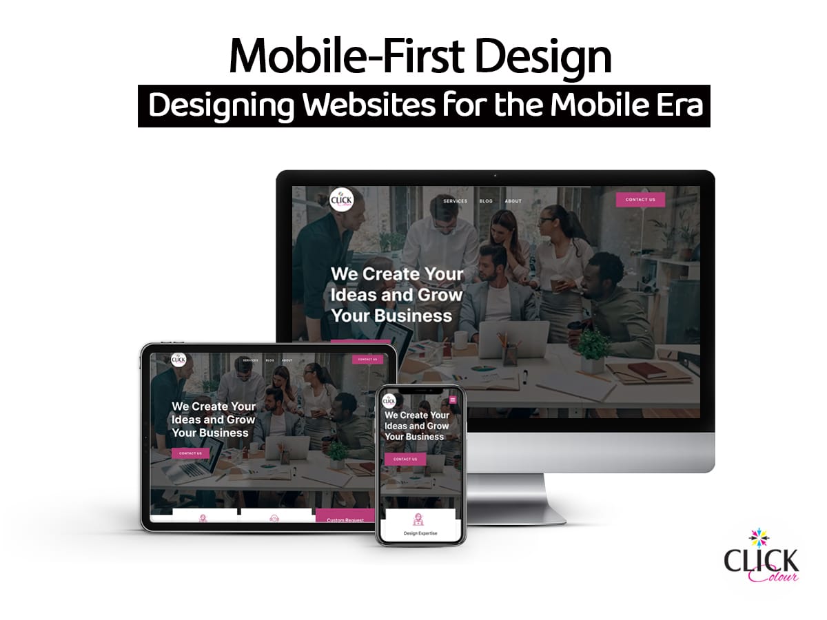
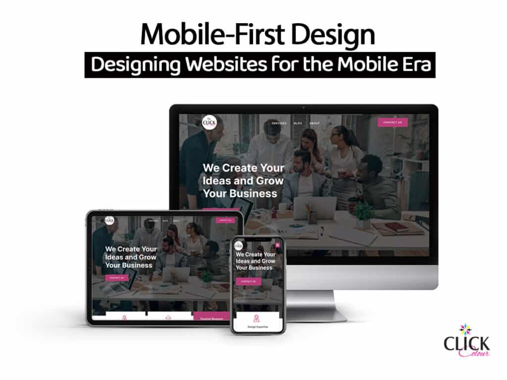
Mobile-first design is a web development strategy that prioritizes the design and functionality of a website for mobile devices before addressing desktop or other screen sizes. This approach recognizes that the majority of internet users now access websites and apps via smartphones and tablets. By starting with mobile design, businesses ensure that their websites are user-friendly and perform well on smaller screens.
The Importance of Mobile-First Design for SMBs
- User-Centric Design: Mobile-first design forces businesses to focus on what matters most to users. It encourages simplicity, streamlined content, and intuitive navigation, all of which contribute to a better user experience on mobile devices.
- Optimized Performance: Mobile-first design often results in faster load times and improved performance, which is crucial for retaining mobile users who tend to be impatient when waiting for websites to load.
- Search Engine Ranking: Google and other search engines prioritize mobile-friendly websites in their rankings. A mobile-first design can lead to better search engine optimization (SEO) and higher visibility in search results, increasing organic traffic.
- Cost-Efficiency: Developing a mobile-first design can be cost-effective for SMBs. Starting with a mobile-focused approach allows you to identify and prioritize core content and features, potentially reducing development and maintenance costs.
- Adaptability: A mobile-first design is inherently adaptable. As screen sizes and device types continue to evolve, a mobile-first website is well-prepared to accommodate these changes, ensuring your site remains accessible and functional.
Practical Tips for Implementing Mobile-First Design
- Content Prioritization: Identify and prioritize essential content and features for mobile users. This helps ensure a streamlined and user-centric experience.
- Responsive Design: Implement responsive web design techniques to ensure your website adapts seamlessly to various screen sizes and orientations.
- Touch-Friendly Elements: Ensure that buttons and interactive elements are adequately sized and spaced to accommodate touch interactions. This prevents users from accidentally clicking the wrong elements.
- Optimize Images and Media: Compress and optimize images and multimedia content to reduce load times on mobile devices.
- Progressive Enhancement: Start with a basic, functional design for mobile and then progressively enhance the experience for larger screens. This approach ensures that your website is accessible to all users.
- Testing: Regularly test your website on various mobile devices and browsers to identify and address any usability issues specific to mobile users.
As the world continues to go mobile, SMBs cannot afford to overlook the significance of mobile-first design. By prioritizing the mobile experience, businesses can improve user satisfaction, enhance their online visibility, and future-proof their websites. Embracing mobile-first design isn’t just a trend; it’s a strategic decision that can make a substantial difference in the success and competitiveness of small and medium-sized businesses in the digital era. So, take the leap into the mobile-first world and ensure your business is ready for the future of online interactions.

